Kotlet w bułce
Kotlet w bułce proves that a familiar flavour can receive a fresh, expressive and recognisable identity without losing its local character.
A classic presented through a new language
The brand is built around a simple dish that needs little explanation. The challenge was to stand out in an urban environment while keeping the offer direct, Silesian and informal.
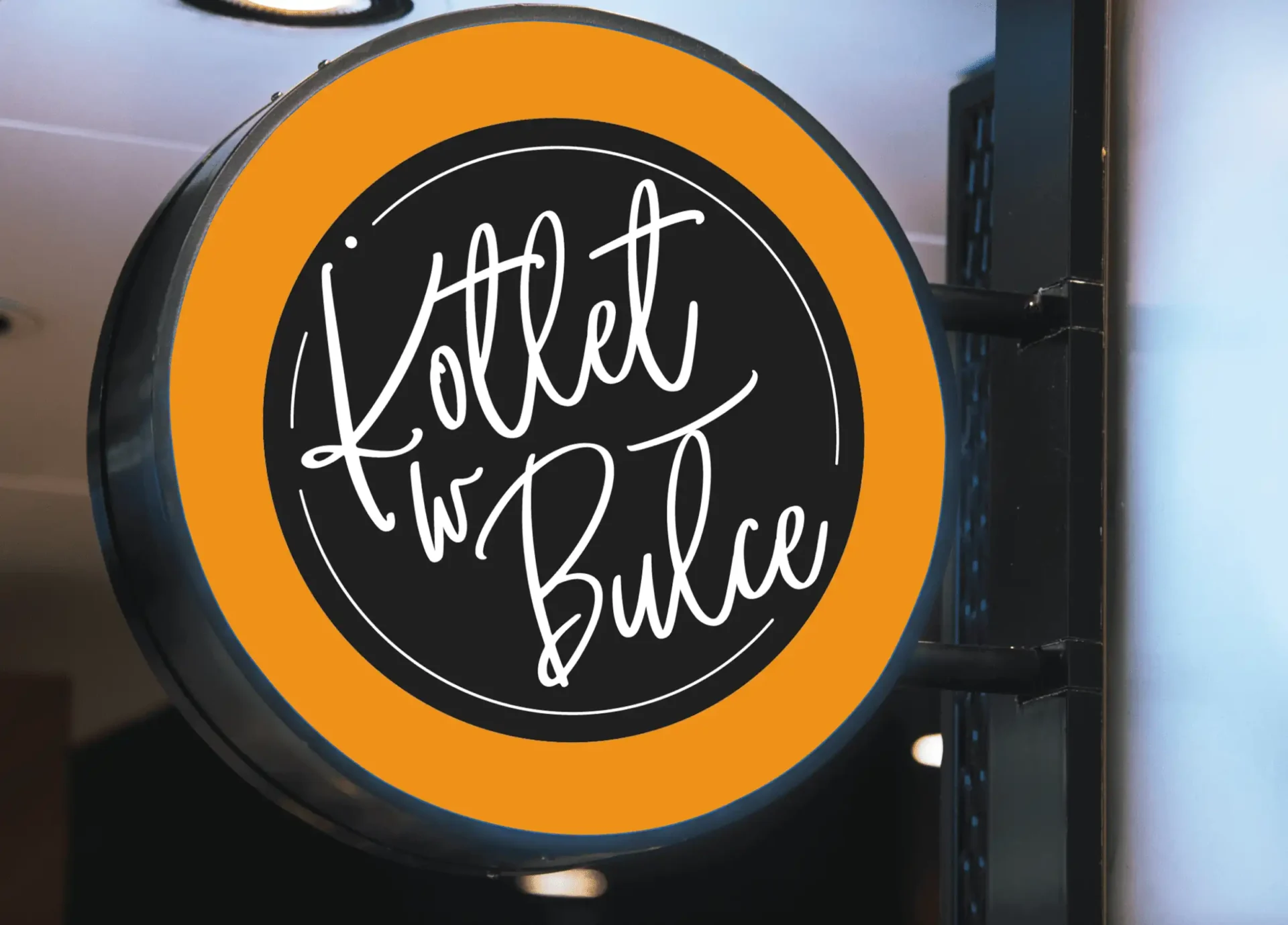
Decisive typography became the central part of the logo. Simple construction, bright colour and balanced proportions make the name visible from a distance during events, festivals and everyday sales.
2018
Services

Graphic Designer / Illustrator
Paulina Rymer


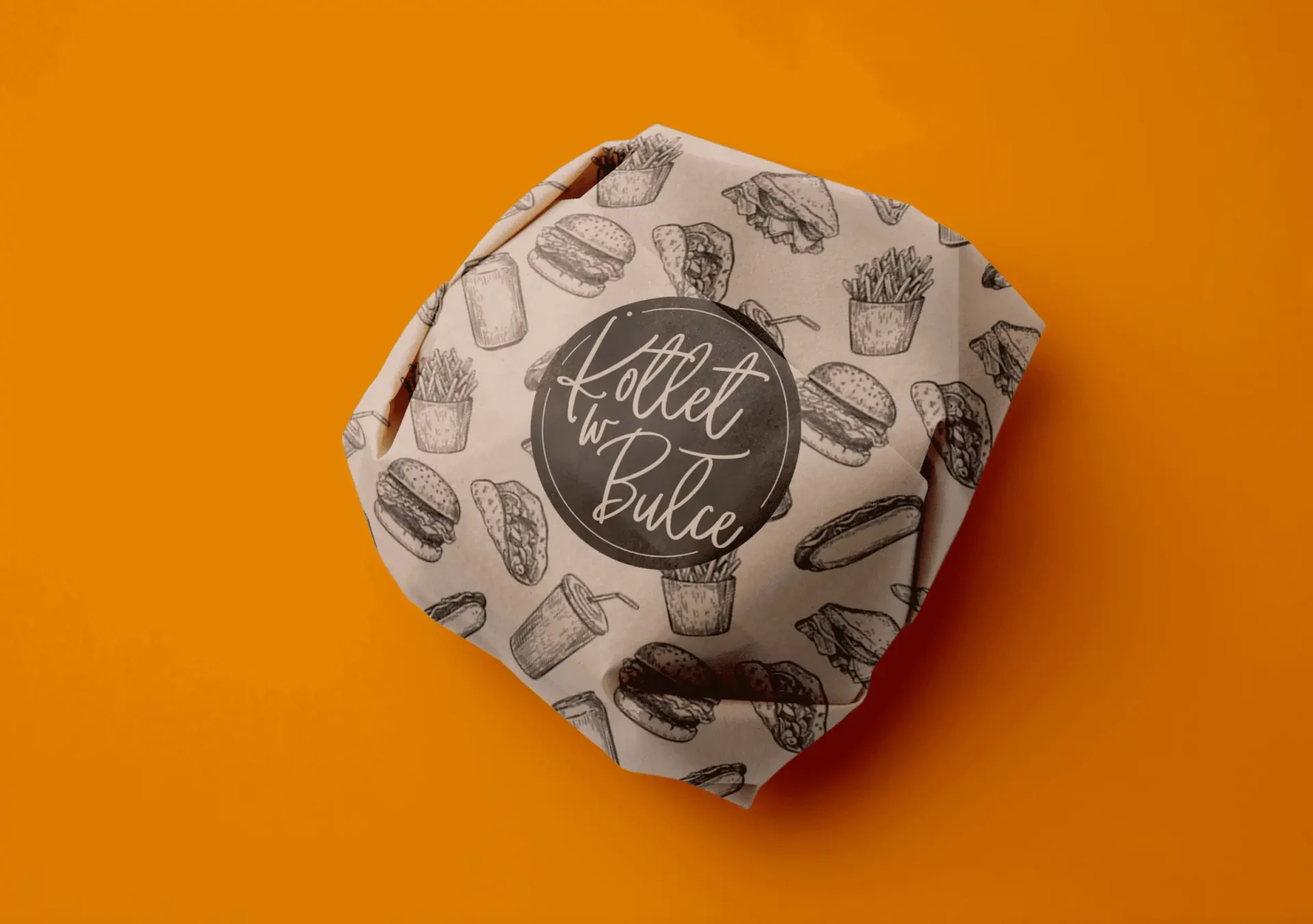
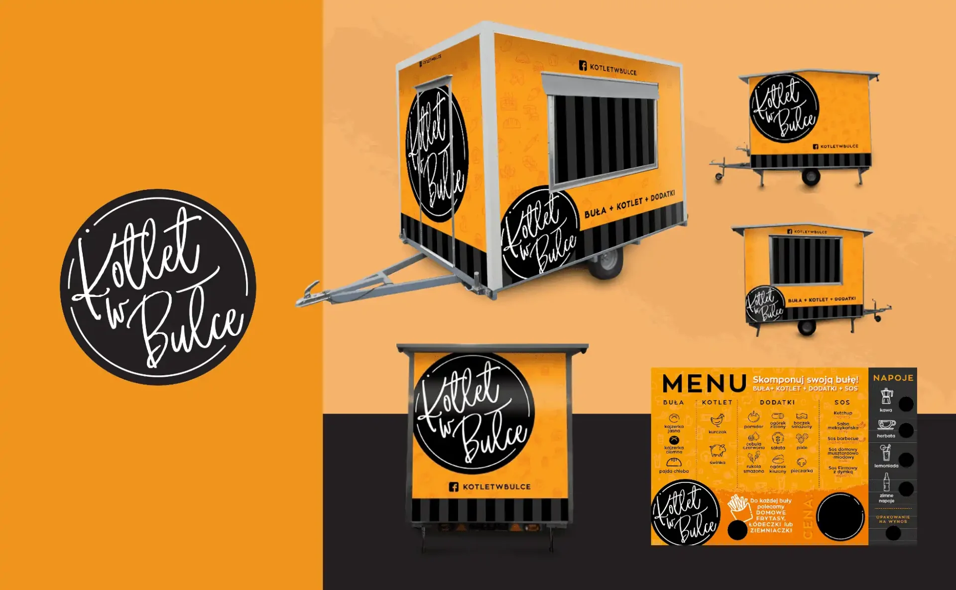
The visual system supports the vehicle, menu, packaging, team clothing and social communication. Every touchpoint preserves the same energy while adapting scale and composition to its format.
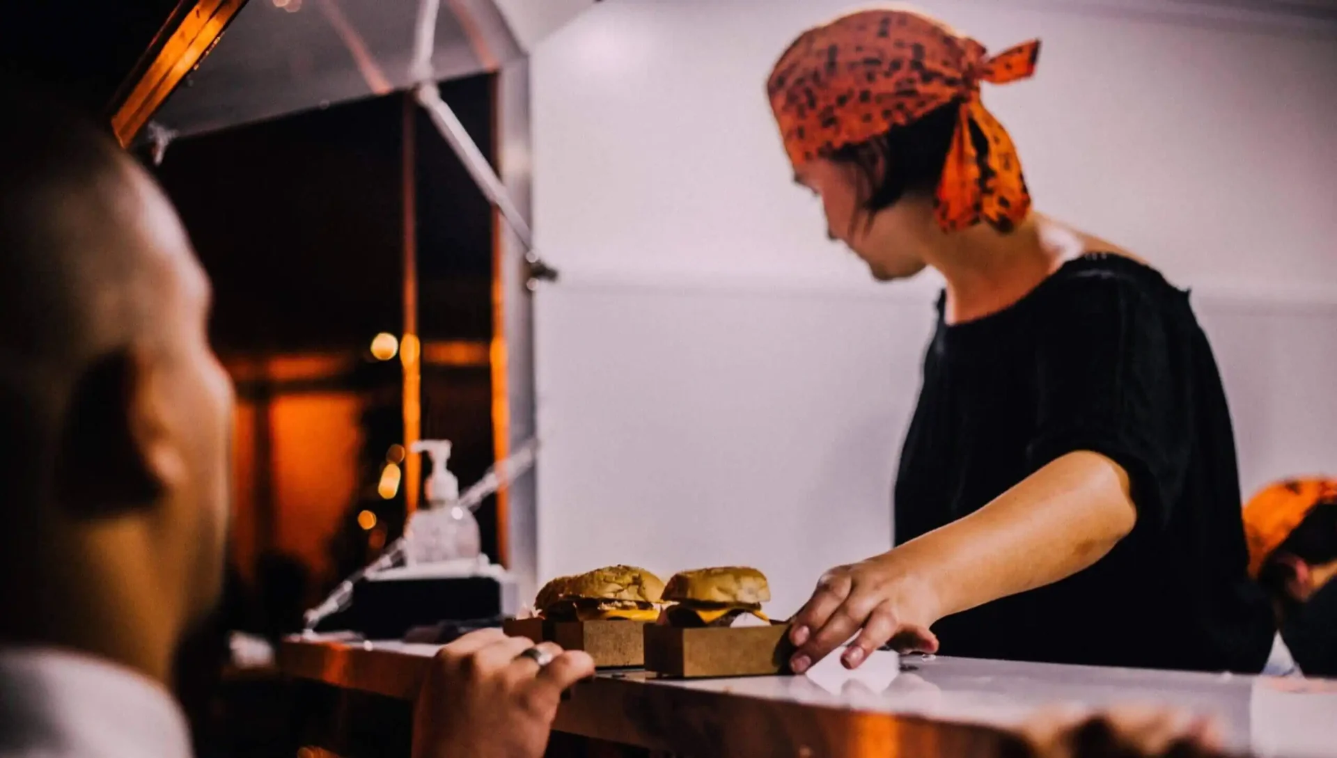
Brand language remains simple and direct. Instead of imitating a premium restaurant, the identity highlights product authenticity, immediate customer contact and street food atmosphere.
Visibility, recognition and room to grow
A strong mark builds recognition at the point of sale and in digital material. The modular identity allows new menu items, events and promotion to appear without losing consistency.
The result gave a classic dish its own character and created a recognisable point on the Silesian food map. The project demonstrates how strategy and consistent design can strengthen even a very simple business concept.
The project combined the venue's distinctive personality with a simple path to the information customers need most. The menu, location, opening hours and contact options were arranged so a visitor could make a decision within moments. The visual layer remains bold and memorable without making the mobile experience harder, which is essential because phones are the primary device for restaurant customers.

